Climate-gate

Never let science get in the way of preconceived beliefs?

We know that we are in the midst of long term global warming.
Therefore, arctic sea ice cannot be increasing in volume.
Therefore the cryosat data must be wrong.
Therefore we should deny the science offered by the ESA's cryosat data?
And, if the NSIDC agrees with the ESA, well, then, they must be wrong too?

Seems logical?

Rationality on the other hand is a whole different matter.
 
We know that we are in the midst of long term global warming.
Therefore, arctic sea ice cannot be increasing in volume.
Where do you get that? It increases every fall and winter. It increases after especially cold months - or after especially cold years.
However, on the average, it is decreasing - thus the cryosat data is correct.
Both logical and rational.
 
On the other hand, Greenland and possibly Antarctica seem to be loosing grounded ice volume based on elevation studies.
Though, the snow may be effecting the readings.
 
sculptor said:
Therefore the cryosat data must be wrong.
Therefore we should deny the science offered by the ESA's cryosat data?
And, if the NSIDC agrees with the ESA, well, then, they must be wrong too?

Seems logical?
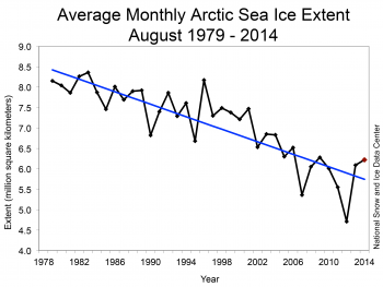
We've been trying to get you to pay attention to the data for many pages now. Why do you refuse to examine graphs of data and trend lines and so forth? Billy T's are quite elegant, the one I linked to is very clear, what are you having trouble seeing?
 
We've been trying to get you to pay attention to the data for many pages now. Why do you refuse to examine graphs of data and trend lines and so forth? Billy T's are quite elegant, the one I linked to is very clear, what are you having trouble seeing?

Simple
Is the cryosat data for the Arctic ocean reflected in the (old) piomas chart?

Before cryosat, on a good day, volume was a wild guess based on a few data points. These guesses made their way into the posted charts. The main problem being, that the ice was constantly moving, and the thicker ice above Greenland and the east Canadian islands was grossly under represented. With more accurate data, the charts were not revised to accurately reflect the cryosat data.

So, the main problem, it would seem, is that I have not seen what is not there.

from the ESA/Cryosat folks:
16 December 2013
Measurements from ESA’s CryoSat satellite show that the volume of Arctic sea ice has significantly increased this autumn.

The volume of ice measured this autumn is about 50% higher compared to last year.

In October 2013, CryoSat measured about 9000 cubic km of sea ice – a notable increase compared to 6000 cubic km in October 2012.

Over the last few decades, satellites have shown a downward trend in the area of Arctic Ocean covered by ice. However, the actual volume of sea ice has proven difficult to determine because it moves around and so its thickness can change.

CryoSat was designed to measure sea-ice thickness across the entire Arctic Ocean, and has allowed scientists, for the first time, to monitor the overall change in volume accurately.

http://www.esa.int/Our_Activities/Observing_the_Earth/CryoSat/Arctic_sea_ice_up_from_record_low
 
sculptor said:
Is the cryosat data for the Arctic ocean reflected in the (old) piomas chart?
My link's graph goes up to right now - 2014.

sculptor said:
16 December 2013
Measurements from ESA’s CryoSat satellite show that the volume of Arctic sea ice has significantly increased this autumn.

The volume of ice measured this autumn is about 50% higher compared to last year.

In October 2013, CryoSat measured about 9000 cubic km of sea ice – a notable increase compared to 6000 cubic km in October 2012.
That agrees with both my links and Billy T's graphs. You can see the uptick in volume to the beginning of 2014 from the low point at the end of 2012 clearly graphed, and the percentages claimed are quite close.

Why aren't you paying attention to all this data we've been posting for you? What is it about trend lines and so forth that you find so difficult to understand?

sculptor said:
Before cryosat, on a good day, volume was a wild guess based on a few data points. These guesses made their way into the posted charts
Wild guesses based on a few points that show a consistent trend for decades now. You are posting as if a year to year change somehow conflicted with this trend. Is taht what you intend to post?
 
You really see the 9,000 cubic kilometers of Arctic ice represented on those graphs?
Or even the 6,000 cubic kilometers from the previous year?

WOW

(That's amazing)
 
You really see the 9,000 cubic kilometers of Arctic ice represented on those graphs?
Or even the 6,000 cubic kilometers from the previous year?

WOW

(That's amazing)


May, 2014

Three years of observations from ESA’s CryoSat satellite show that the Antarctic ice sheet is now losing 159 billion tonnes of ice each year – twice as much as when it was last surveyed.

August 2014

Measurements from ESA’s CryoSat mission have been used to map the height of the huge ice sheets that blanket Greenland and Antarctica and show how they are changing. New results reveal combined ice volume loss at an unprecedented rate of 500 cubic kilometres a year.


http://www.esa.int/Our_Activities/O...nds_sharp_increase_in_Antarctica_s_ice_losses


:shrug:

Figure3-350x263.png
 

May, 2014

Three years of observations from ESA’s CryoSat satellite show that the Antarctic ice sheet is now losing 159 billion tonnes of ice each year – twice as much as when it was last surveyed.

August 2014

Measurements from ESA’s CryoSat mission have been used to map the height of the huge ice sheets that blanket Greenland and Antarctica and show how they are changing. New results reveal combined ice volume loss at an unprecedented rate of 500 cubic kilometres a year.


http://www.esa.int/Our_Activities/O...nds_sharp_increase_in_Antarctica_s_ice_losses


:shrug:

Figure3-350x263.png

see post 1345
 
sculptor said:
You really see the 9,000 cubic kilometers of Arctic ice represented on those graphs?
Or even the 6,000 cubic kilometers from the previous year?
I see trend lines of Arctic ice volume and extent with strong negative slopes, which continue to feature strong negative slopes with or without the same percentage one year gain in ice volume you seem fixated on.

Why are you ignoring all that scientific data?
 
I see trend lines of Arctic ice volume and extent with strong negative slopes, which continue to feature strong negative slopes with or without the same percentage one year gain in ice volume you seem fixated on.

Why are you ignoring all that scientific data?

I ignore none of it.
Including the more recent findings.
 
sculptor said:
I ignore none of it.
Including the more recent findings.
You are ignoring all of it, and posting one year's change from last year as if it conflicted with the overall trend which includes this year's data. If you pay attention to the overall trend including this year's data, as your source does, you will post things like this:
[quote="eas cryosat link" ] “It’s estimated that there was around 20 000 cubic kilometres of Arctic sea ice each October in the early 1980s, and so today’s minimum still ranks among the lowest of the past 30 years,” said Professor Andrew Shepherd from University College London, a co-author of the study. [/quote]
 
You're either intellectually dishonest or stupid. Probably both.

You need an attitude adjustment.

Exercise moderation in all things child, especially when braying like a jackass.

Perhaps it would be better to confine your self to comments about climate?
 
Frantically putting out papers:

Three stalling periods with very little warming could be found within the series, from 1878 to 1907, from 1945 to 1969 and from 2001 to the end of the series, all of them coincided with a cooling phase of the MDV. Henceforth, MDV seems to be the main cause of the different hiatus periods shown by the global surface temperature records. However,...

http://www.plosone.org/article/info:doi/10.1371/journal.pone.0107222

Added as Excuses for the Pause #52:

http://wattsupwiththat.com/2014/09/...atural-climate-variability-as-secular-trends/

Someone earlier tried to redirect my focus to the evil energy monies vs struggling climate scientists (my ad lib); but providing no sources for allegations. Furthermore the focus was on gross revenue as though that verifies evil oil outspends gov. Well:

$19 BILLION (including tax breaks for green tech) vs
$5 Billion on Cancer
$10 Billion on all categories of Health related Clinical research.

http://www.whitehouse.gov/sites/def...gislative_reports/fcce-report-to-congress.pdf

http://report.nih.gov/categorical_spending.aspx

Sooo how much money do you think would be earmarked for climate if the 'consensus' was Nothing to see here folks; its all within natural variability and at this point the influence is so small we cant separate the anthro component from the signal.

What a waste of vital dollars. The waste is the IPCC and its directive. Should have stuck with climate regardless of source.

Hopefully tonight/tomorrow the sky will be clear so I can go out and see northern lights.

http://www.gi.alaska.edu/AuroraForecast/NorthAmerica/2014/09/12
 
Janus58 is able to tell if I am on to something or not - hope he is reading, but have not seen him posting recently.

SUMMARY: I'm no expert like Janus58 is, but it does seem like I have found below why the 60 year MDV cycle exits. If so, humans have about 60 years more before CO2, and the peak of the next MDV cycle lead to extinction (via 35C wet bulb). I have said all along that Guy MaPhersion was basically correct, but has extinction to0 soon - by about 35 years, it seems. (I did not edit out my first stupidity - let it all hang out so you can see my "mental evolution.")
Graph below from your second link is good summary of your first link, which appears to me to be a careful and valid analysis (assuming the data used is).
jrc-graph-global-temperature-anomalies-640.jpg
There does seem to be a significant MDV oscillation with approximately a 62 year period. I have only an unconfirmed guess as to what is the cause of the MDV (Multi-Decade-Variation). But will try to see if Mars and Jupiter do align with that period to maximally distort earth's orbit with that period - modulate Earth's eccentricity. - My first guess*, especially if they are on opposites sides of the sun 31 years after alignment.

The "secular trend" (red line) is accelerating upwards - no doubt in my mind that is mainly due to the annually increasing CO2 in the atmospheric. I doubt if the dip pre 1880 is real but it might be: Humans were increasing in numbers, building houses of wood and making furniture, boats, etc. from wood that in decades earlier would die and decay - more "sequestering" of CO2, but also were using it for more cooking and heating - hard to guess the net effect.

Anyway thanks for these links - I think on first reading quite important new, to me at least, idea.
By edit:
* PS my first thoughts were silly: Mars has a period (couple of earth years ?) much too short to be the effective 62 year conjunction.
http://en.wikipedia.org/wiki/Conjunction_(astronomy) said:
In May 2000, in a very rare event, several planets lay in the vicinity of the Sun in the sky as seen from the Earth, and a series of conjunctions took place. Jupiter, Mercury and Saturn each reached conjunction with the Sun in the period 8-10 May. These three planets in turn were in conjunction with each other and with Venus over a period of a few weeks. However, most of these conjunctions would not have been visible from the Earth because of the glare from the Sun.
That would effectively increase the solar attraction - slightly move earth closer to sun for a few years. I.e. agrees with the MDV increasing prior to May 2000 to its peak effect and beginning to decrease afterwards. - Perfect agreement with the green curve's peak! But Mercury is small and with short year so just makes tiny wiggles of short term their SST analysis would not even notice.

I was only guessing that Mars being closer to Earth would have the more important conjunctions with Jupiter than Saturn. need to do the calcualtion. Perhaps it is the Jupiter/ Saturn conjunction that has a 62 year period? Also I or some one needs to process the effect that 6 months later the pull of Jupiter and Saturn effectively weakens the solar attraction - I.e. this also distorts Earth's eccentricity; however, note also that 6 months is the period of the shift from summer to winter and most of their data probably came from the N. Hemisphere. Doing this correctly is quite complex. - Perhaps a new thread is required?

Surely someone good at searching (I'm not) can find it all worked out in the astronomical literature how the other planet moducate Earths ecentricity - and Solar Intensity at on Earth. - Satellite have not been measuring that accurately for 62 years I guess.

By second edit:
Keplers_trigon.jpg
A drawing by Kepler in 1606. Note that the Jupiter/Saturn conjunctions (which occur about every 20 years) do return to essentially the same point in the heavens about every 60 years. Perhaps with different locations in the ecliptic plane? Or more likely, I guess is only one of the three 120 degree apart conjunction is along the Earth's current eliptical long axis to have greatest modulation of Earth's eccentricity - largest effect. Can anyone super impose Earth's major axis on this drawing? (I copied it from: http://en.wikipedia.org/wiki/Great_conjunction)
They should redo their SST analyse to look for a 20 year periodicity also if it would not fall out naturally.
Third edit:
Earth is farthest from sun at start of July -at aphelion. but I don't know the zodiac signs, especially not back in Kepler's day and they may have changed (some even dropped or added I think). with help from wiki it seems that aphelion is much closer to the top of the three "great conjunctions" than the other two in above drawing. I. e. an exactly vertical major axis for earth in the above drawing, if zodiac was same then as now.

SUMMARY: I'm no expert like Janus58 is, but it does seem like I have found why the 60 year MDV cycle exits. If so, humans have about 60 years more before CO2, and the peak of the next MDV cycle lead to extinction (via 35C wet bulb). I have said all along that Guy MaPhersion was basically correct, but has extinction too soon - by about 35 years it seems.
 
Last edited by a moderator:
SUMMARY: I'm no expert like Janus58 is, but it does seem like I have found why the 60 year MDV cycle exits. If so, humans have about 60 years more before CO2, and the peak of the next MDV cycle lead to extinction (via 35C wet bulb).
You are once again being alarmist and irresponsible - shame on you. And you're getting worse.
 
Back
Top